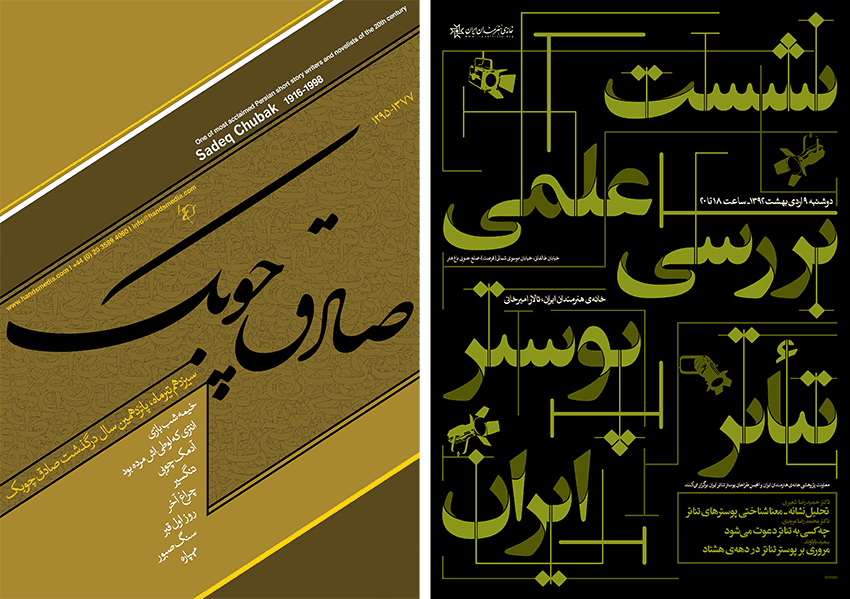
We move through information with visual cues. Good user experience (UX) creates preference and influences memory. Typography adds value by creating information hierarchy which leads the eye across the journey of websites, apps and other digital media.
Ashley Karr and Jill Da Silva are co-instructors for a User Experience Design Immersive beginning on June 2 at General Assembly in Santa Monica. They shared a little bit about what they'll be teaching and how good typography works to influence behaviors.
Ashley has a Masters of Science in Human Factors and Systems Engineering with a slew of HTML, CSS, JavaScript, JQuery skills acquired formally, others informally, and some on the job. Her clients include UCSF, CA State Dept of Public Health, Emory University, GreenDot, Walmart, Frontier Communications and more.
Jill’s background in UX comes from over 13 years of graphic and web design. She recently left Dex One as Senior Manager, UX and Design to teach full-time at General Assembly. Jill also worked at ACTV8.me as the Director of Product Development, developing companion apps that synced to such shows as The Celebrity Apprentice, So You Think You Can Dance, Master Chef and more.
How does one get started in UX?
Ashley: User Experience is multi-disciplinary and there are no industry or legal standards set yet, so currently there tends to be no normal route to get here. However, this is changing and changing fast. User Experience Research and Design has grown from a long history within academia and the top industry labs. If you want to “do” UX, then at the very least, read a textbook written by someone like Yvonne Rogers who has been “doing” UX for years and learn from her. Your background doesn’t matter, but your UX training does.
Jill: In my experience, many UX designers come from a background of graphic and web design. Often, they have been practicing the methods of a UX designer without even naming it “UX Design.” I think UX designers have a common thread of empathy for the users and a strong desire to make delightful and amazing experiences, and, as such, a UX designer can come from many varied backgrounds such as anthropologists, product owners, product managers, sales, graphic design, developers, engineers and more!
How are design fundamentals taught in the class?
Ashley: We have them read About Face on their own time. There’s lectures in morning. Workshop in the afternoon. And project-based learning.
Jill: The students are required to do some pre-work in GA’s Fundamentals of Design. We also cover some UI design basics throughout the course. We point out the basics of hierarchy which help the user understand the information on the page. There is not much time to cover all UI design (typography included) as there is so much to cover for UX principles and practice. And, while a UX designer may come from a UI background, UI is not a required or deeply learned skill in our course. It is common in the workplace for the UX designer to hand off their wireframes to a UI designer for graphical development. That being said, we have the students do competitive analyses for their projects. This helps the students notice many of the practiced design fundamentals, including typography. We also go over grids and best practices of design, i.e. teaching the students to design for the reader (a.k.a. “users”).
User-centered design is so important! Are there visual or typographic principles you could share that help drive a strong user experience?
Ashley: Readability! There has been a lot of very helpful and valuable research done within the disciplines of psychology and human factors regarding how people read. A few highlights are these: people read serif fonts and left-justified paragraphs faster and can comprehend more of the content. However, people find justified paragraphs with sans-serif fonts more aesthetically pleasing. Hmmm… some things to think about as a designer.
Jill: Again, the focus is more on structure and the user experience and less on the graphic design side of UI. We do cover hierarchy font size, weight, color, background, and readability. We also strongly direct students to refer the Nielsen Norman Group’s site as a trusted resource in answering many of their UX design questions.
How do you feel typography helps the overall user experience of content viewed on digital devices?
Ashley: Clarity and readability are the most important characteristics of typography on digital devices. If people can’t read what you write, because of font-size, color, shape, what-have-you, what you write doesn’t matter.
Jill: Typography is really important for the user experience. There must be hierarchy for the user to be able to organize and make sense of the page (grouping).
What’s the most valuable skill students will walk away with from the class?
Ashley: Most valuable or marketable skill: user experience research and design.
Jill: The students will leave the UXDI course with an enviable working knowledge of UX as well as an increased growth of the following skills: critical thinking, collaboration, communication.
For more about Ashley's and Jill's 10-week User Experience Design Immersive class, check out General Assembly's web site.


